Beige had its moment—but 2026 is rewriting the rules. If you’re searching for the interior color trends 2026, you’re likely planning a refresh and want choices that feel bold yet livable, modern yet lasting. Selecting paint can feel permanent, even risky, which is why understanding the “why” behind emerging palettes matters as much as the colors themselves. This definitive forecast breaks down the shades set to define homes in 2026, the psychology fueling their rise, and practical ways to bring them into your space with confidence. Consider this your expert-backed guide to creating a home that feels intentional, current, and future-proof.
The Philosophy of 2026 Color: From Reaction to Intention
For years, we hid behind sterile grays and gallery whites (yes, the “safe” era). I think 2026 marks a quiet rebellion. Instead of reactive minimalism—design choices driven by resale value or Instagram trends—we’re choosing intentional color, shades that signal comfort, identity, and emotional depth.
Some argue neutrals are timeless. Fair. But timeless shouldn’t mean lifeless. The newest interior color trends 2026 reflect two forces:
| Influence | What It Means at Home |
|---|---|
| Natural Tranquility | Clay reds, moss greens, oceanic blues that lower visual stress (biophilic design links nature tones to well-being; Kellert, 2018). |
| Digital Harmony | Soft lavenders and luminous teals inspired by ambient tech interfaces. |
I’m especially drawn to how texture reframes color. Plaster warms up beige. Bouclé softens sage. Brushed metals make deep blues feel intentional, not moody. Color isn’t flat anymore—it’s sensory.
Interestingly, this mirrors shifts in construction itself, particularly in how technology influences new home construction trends.
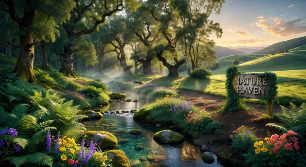
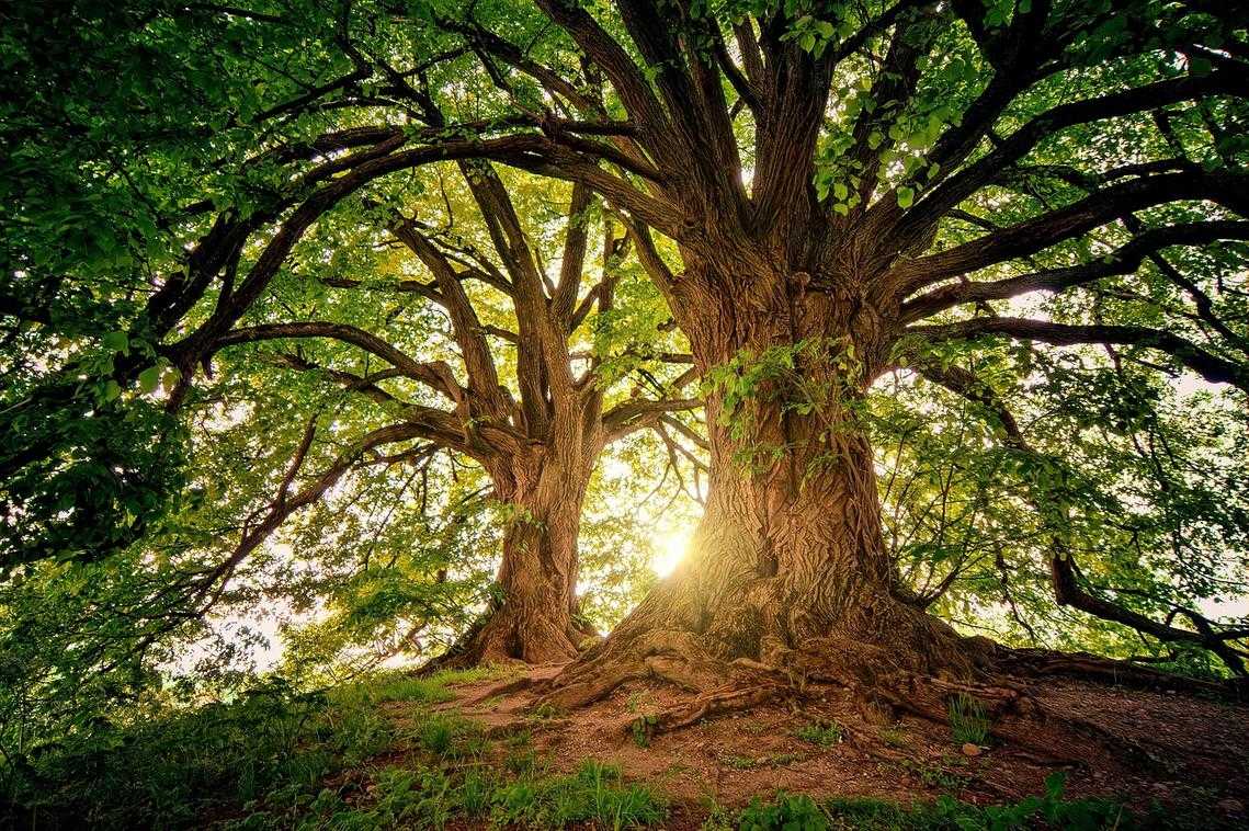
Palette 1: The Biophilic Sanctuary
I once repainted a stark white bedroom in Terracotta Clay, and the shift was immediate. What felt clinical suddenly felt like an exhale (you know that feeling when you step into a cozy cabin after being out in the cold?). That’s the power of biophilic design—biophilic meaning a design approach that nurtures our innate love of nature (Wilson, 1984).
This palette centers on:
- Terracotta Clay – a sunbaked, grounding orange-brown
- Forest Floor Green – deep, organic, and slightly mossy
- Mushroom Taupe – a soft, earthy neutral with gray undertones
- Faded Denim Blue – muted and sky-washed, never overpowering
The “why” behind these hues is rooted in psychology. Earth tones have been shown to promote calm and stability because they echo landscapes our brains evolved in (Kellert, 2012). Some critics argue earthy palettes can feel heavy or dated. Fair point. But when balanced with texture and light, they feel timeless—not trendy (think Nancy Meyers kitchen, not ‘70s rec room).
In living rooms and bedrooms, layer tones within the same family for a refined monochromatic look. Pair Forest Floor Green walls with lighter sage textiles. Combine Mushroom Taupe bedding with deeper cocoa accents. The subtle variation keeps the space sophisticated.
Here’s where technology elevates the mood. Tunable white smart lighting—lighting that shifts color temperature throughout the day—mimics sunrise’s warm glow and midday’s cooler clarity. Against these shades, the effect is transformative. Warmer light deepens Terracotta; cooler light sharpens Faded Denim.
It’s no surprise this direction is gaining traction in interior color trends 2026. Nature, after all, never really goes out of style.
Palette 2: Tech-Infused Digital Pastels
If last decade’s interiors were about stark contrast (think charcoal walls and brass everything), 2026 softens the edges. Tech-Infused Digital Pastels—Washed Apricot, Digital Lavender, Celadon Green, and Cyber Lime—offer a lighter, more optimistic direction.
Core Colors Defined
- Washed Apricot: a muted peach with a sun-faded quality (like golden hour, bottled).
- Digital Lavender: a cool-toned purple with a subtle gray base that keeps it from feeling sugary.
- Celadon Green: a pale, porcelain-inspired green rooted in classic ceramics.
- Cyber Lime: a softened neon—energetic but tempered for real walls.
A vs B: Moody Neutrals or Luminous Pastels?
A: Deep Charcoal + Navy
Creates drama and intimacy. Great for media rooms. But in smaller spaces, it can feel heavy (especially under artificial light).
B: Digital Pastels
Reflect more light, expand perceived space, and signal calm productivity. Ideal for home offices, kitchens, and bathrooms where clarity matters.
The why behind this shift? These shades mirror gentle optimism and the seamless blending of physical and digital life. They align with interior color trends 2026, where airy palettes meet high-tech functionality.
Practical Application
Use Celadon Green behind matte-black shelving for a crisp contrast. Pair Washed Apricot with light oak cabinetry in kitchens for warmth without visual clutter. Digital Lavender works beautifully behind sleek white desks (pro tip: choose a satin finish to subtly bounce task lighting).
Smart Home Synergy
These hues act as neutral canvases for RGB accent lighting and digital art displays. A Cyber Lime wall can glow cooler at night or warmer by day—dynamic, personalized, and future-ready. For more on optimizing connected spaces, explore smart home basics.
Bringing the Trends Home: A Practical Integration Guide
Designers love the 60-30-10 rule, but let’s CLARIFY what it means. It’s a simple ratio for dividing color in a room so it feels balanced, not chaotic (unless you’re going for rock-concert energy).
- 60% DOMINANT COLOR: walls or large surfaces.
- 30% secondary color: upholstery or cabinetry.
- 10% accent: lighting, art, or tech devices.
In interior color trends 2026, palettes lean earthy with electric twists, so that 10% can do serious work. Bold accents are shifting from pillows to hardware. A smart speaker in Cyber Lime or a thermostat in Washed Apricot becomes FUNCTION AND FOCAL POINT.
Still unsure? Use augmented reality apps to preview paint on your actual walls. AR (AUGMENTED REALITY: tech that layers digital images over real spaces) helps you see how light and screens affect tone before you commit. PRO TIP: test morning and night views. Lighting changes everything.
As vibrant hues and bold color palettes take center stage in interior design this year, they can also inspire you to reimagine less glamorous spaces, like your garage—especially when you explore our guide on how to organize your garage effectively at Livpristhouse – for more details, check out our How To Organize Your Garage Livpristhouse.
Coloring Your Future: A Home That Reflects 2026
The beauty of interior color trends 2026 is their balance—grounded, nature-inspired hues for calm and stability, paired with digitally influenced tones that spark creativity and optimism. You set out to understand how to choose colors with intention, and now you have a clear direction for creating a home that feels both modern and meaningful.
You don’t have to second-guess every paint swatch anymore. This roadmap removes the fear of choosing the “wrong” color and replaces it with confidence rooted in purpose.
Ready to transform your space? Explore our expert-backed trend updates and practical guides today—trusted by thousands of design-forward homeowners—and start building a sanctuary that feels timeless, personal, and unmistakably yours.
 Jennifer Burnsivino is the kind of writer who genuinely cannot publish something without checking it twice. Maybe three times. They came to insightful reads through years of hands-on work rather than theory, which means the things they writes about — Insightful Reads, Home Automation Protocols, Smart Interior Innovations, among other areas — are things they has actually tested, questioned, and revised opinions on more than once.
That shows in the work. Jennifer's pieces tend to go a level deeper than most. Not in a way that becomes unreadable, but in a way that makes you realize you'd been missing something important. They has a habit of finding the detail that everybody else glosses over and making it the center of the story — which sounds simple, but takes a rare combination of curiosity and patience to pull off consistently. The writing never feels rushed. It feels like someone who sat with the subject long enough to actually understand it.
Outside of specific topics, what Jennifer cares about most is whether the reader walks away with something useful. Not impressed. Not entertained. Useful. That's a harder bar to clear than it sounds, and they clears it more often than not — which is why readers tend to remember Jennifer's articles long after they've forgotten the headline.
Jennifer Burnsivino is the kind of writer who genuinely cannot publish something without checking it twice. Maybe three times. They came to insightful reads through years of hands-on work rather than theory, which means the things they writes about — Insightful Reads, Home Automation Protocols, Smart Interior Innovations, among other areas — are things they has actually tested, questioned, and revised opinions on more than once.
That shows in the work. Jennifer's pieces tend to go a level deeper than most. Not in a way that becomes unreadable, but in a way that makes you realize you'd been missing something important. They has a habit of finding the detail that everybody else glosses over and making it the center of the story — which sounds simple, but takes a rare combination of curiosity and patience to pull off consistently. The writing never feels rushed. It feels like someone who sat with the subject long enough to actually understand it.
Outside of specific topics, what Jennifer cares about most is whether the reader walks away with something useful. Not impressed. Not entertained. Useful. That's a harder bar to clear than it sounds, and they clears it more often than not — which is why readers tend to remember Jennifer's articles long after they've forgotten the headline.